A MVVM Visual State solution for your Windows Phone app
Do you need to control the visual state of your view from its view model? This blog post will present a simple but useful solution.
Download demo app
Background
A common way to handle state on a page is to control the visibility of different UI areas by using properties in the view model without or in a combination with a converter. It can be both frustrating and time consuming for a UX developer to manually change view model properties each time the result of a state combination needs to be validated or edited.
My recent Windows Phone app T3XT K1NG is a one-page app where all the magic is happening on the main page. It allows the user to type text, open popup windows, start conversions, swipe buttons and more. All these UI states can easily lead into a complex and error-prone code.
I solved these problems by using a combination of visual states, behaviors and a tiny state handler class. Let’s have a brief overview of visual state and behaviors before we look into my demo app.
Visual state
You can create interactivity in your application by defining a different visual appearance for each visual state that your UserControl control, Page control, or control template can be in.
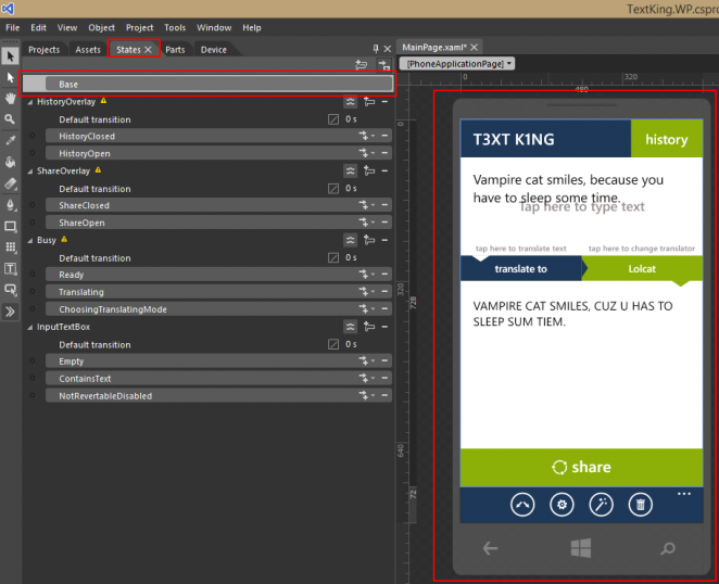
This blog post will not go into details about how to create visual states. You can read more about it on MSDN, but I will let you see how visual states works for the Page control in design-time by showing three screen dumps from Blend with my app T3XT K1NG opened.
The states tab in Blend shows a list of all state groups I defined and their states. When ‘Base’ is selected the visual design surface shows the default view without any state specific design applied.
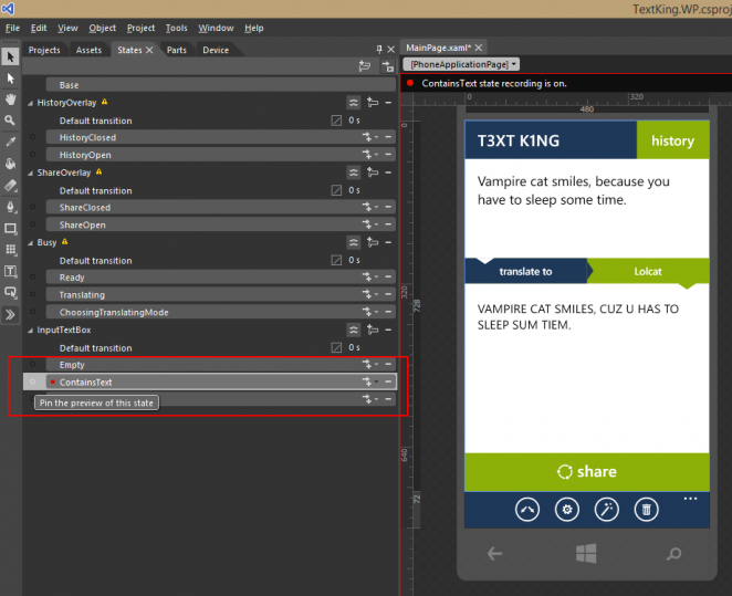
When ‘ContainsText’ is selected in the state group ‘InputTextBox’, the visual design surface is changed to show design specific for the selected state. The “Tap here to type text”-textblock is now invisible because it belongs to the ‘Empty’ state.
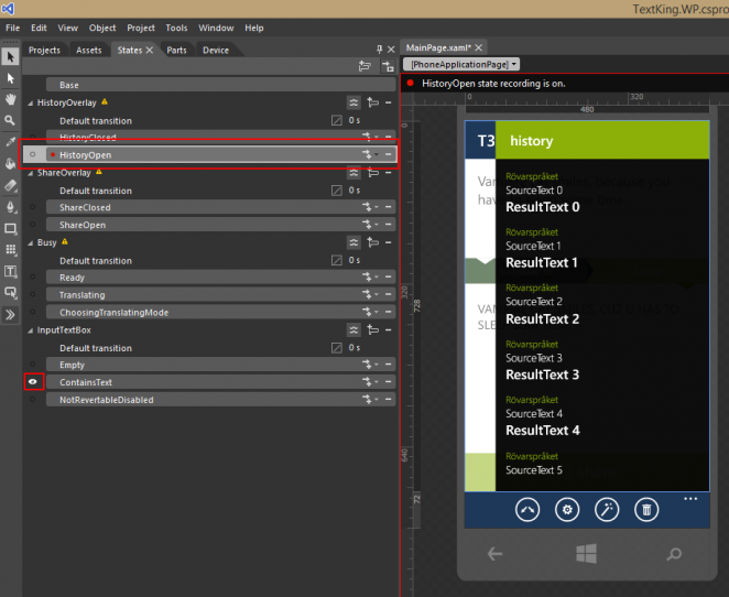
It is possible to preview a combination of multiple states by pinning them. This is done by clicking on the circle in front of the state name. Next screen dump will show the pinning in action.
When ‘ContainsText’ is pinned in the state group ‘InputTextBox’ and ‘HistoryOpen’ is selected in the state group ‘HistoryOverlay’ the visual design surface shows design specific for both states.
This is a gem together with sample data when designing the user interface. You can preview all state combinations without starting the app or making any code changes.
Sometimes you want to change the same property of a XAML object from different states. It is ok if you know that the states won’t interfere with each other, but Blend will remind you with small yellow warning sign beside the affected state groups. To avoid any unpredictable behavior, one solution is to wrap the XAML object with a suitable panel object and let one of the states change its property instead.
A final note about Visual states; Visual Studio does not have this future (yet), you have to use Blend to find the States tab.
Behaviors
A behavior is an object that can be activated based on an event in the UI to perform some action.
In the excellent Pluralsight course XAML Patterns the author Michael Perry shows how to build a behavior to control a compass state from the view model. I have used the same behavior code in the downloadable demo app of this post.
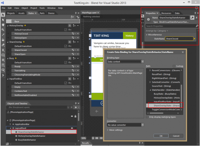
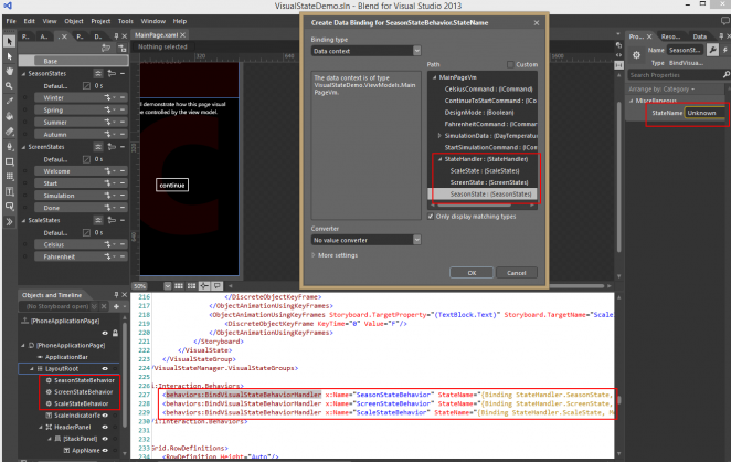
You can change the properties of a behavior when it is placed on a page. The screen dump below shows how I have databinded the behavior to a statehandler in the view model. When the statehandler changes state the event is fetched by the behavior which calls a GotoState method automagically.
Let’s look at my demo app now. First a brief overview and then step by step how I implemented the state handling.
Demo app – Overview
I have created a daylight and season simulator app visualizing a year of temperature data for the Swedish city Malmö where I spend most of my work days at the moment. Try to remember that the purpose of the app is to demonstrate state handling from a view model if the one-page concept sometimes feels a bit strained.
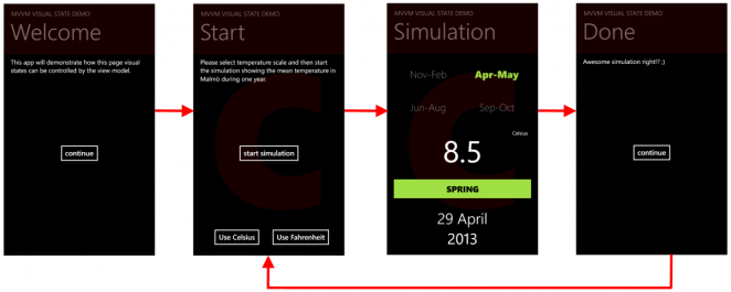
The MainPage consist of four different screens:
- Welcome: Some info text and a continue-button.
- Start: Let user select Fahrenheit or Celsius as scale before starting simulation
- Simulation: Iterates one year of daily temperature data while showing current scale and selected scale.
- Done: Separates Some info text and a continue-button.
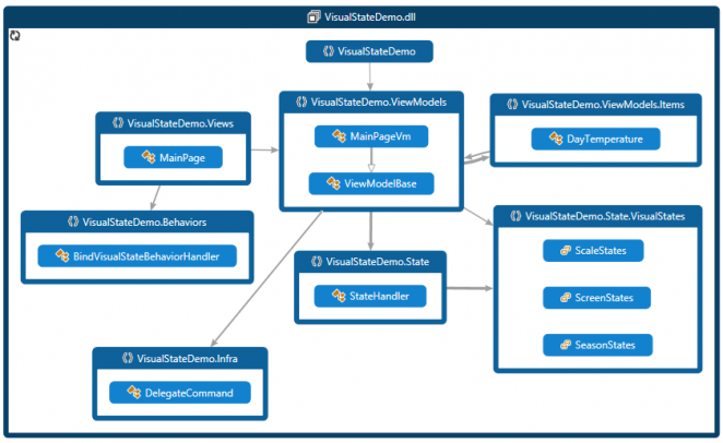
The code dependency diagram shows how the app is built up by a view, MainPage, with a view model, MainPageVm, and its view model item, DayTemperature.
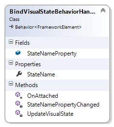
The view model has a statehandler with some Enum states and everything is glued together with the behavior BindVisualStateBehaviorHandler.
I will now describe the main steps for implementing the app.
Demo app – Step 1: Visual states
I will, as mentioned before, not describe how to create visual states in this blog post. Browse to MSDN for more info about it.
I decided to use the following visual states to handle different designs for the one-page app:
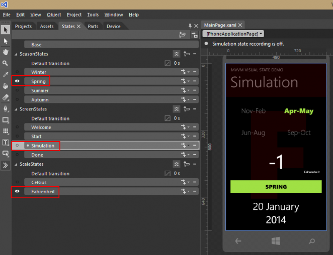
- ScreenStates: Separates the four different screen designs.
- SeasonStates: Separates the four different season designs.
- ScaleStates: Separates Celsius and Fahrenheit design.
This will allow me to preview and design any of the state combinations in Blend. This screen dump shows how the app will look like on the simulation screen during spring season with Fahrenheit selected as scale:
Demo app – Step 2: Visual states Enum classes
The behavior need a way to connect the view model with the visual states. This is done by creating and using Enum classes containing the visual state names.
public enum ScaleStates
{
    Unknown = 0,
    Celsius = 1,
    Fahrenheit = 2,
}

public enum ScreenStates
{
    Unknown = 0,
    Welcome = 1,
    Start = 2,
    Simulation = 3,
    Done = 4
}

public enum SeasonStates
{
    Unknown = 0,
    Winter = 1,
    Spring = 2,
    Summer = 3,
    Autumn = 4
}
Demo app – Step 3: VisualStateHandler class
The state handler is used to keep control over the visual states. It has one property per visual state and methods to change the states.
You can implement the state handler class as advanced as you need to and use frameworks like stateless. This class with a few added features (removed in this example) to handle async calls during the screen transitions and validation of allowed user actions) has been enough for my needs.
I decided to throw exceptions when an incorrect state is set. This is a good help during implementation to prevent logic errors and unnecessary UI calls instead of allowing developers to spam the app with state calls all over the code.
Demo app – Step 4: View model
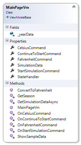
The view model will keep an instance of the state handler as a property for data binding. It will also set correct states during the application lifetime.
Please note that I have used Fody and PropertyChanged.Fody NuGet packages for automagically injecting INotifyPropertyChanged code into properties. If you are new to NuGet, watch this YouTube video: How do you install a NuGet package in Visual Studio 2012?
Demo app – Step 5: BindVisualStateBehaviorHandler
The BindVisualStateBehaviors StateName property will be data binded to one of the statehandlers state properties. It will then be able react on a state change and use VisualStateUtilities.GoToState to switch visual state.
Demo app – Step 6: Bind behaviors to state handler in XAML
Finally it is time to data bind one behavior per state group to the state handler.
Conclusion
With just a few lines of code and by using visual state it is possible to achieve a great blendability and control visual state from the view model. This blog post presented a simple solution for you to build and extend on.
Trackback URL: https://codeblog.silfversparre.com/2014/01/mvvm-visual-state-solution-windows-phone-app/trackback/

